iSlider is a lightweight, high-performant, no library dependencies cross-platform slide controller. It can help handling most sliding effects, offering dozens of transition animations, and presenting various scenarios.
Various animation effects, including effects such as default, rotate, depth, flow, flip, card, fade, etc., and capability of adding custom animations;
Provide rich callback trigger. Adding a callback function is easy, regardless of initialization or during operation;
Easy to configure, e.g. Slide the dampening effect of the cycle, automatic sliding effect, horizontal / vertical sliding, etc.
Automatic matching the desktop mouse movements or gestures on mobile device. Easy to test and use cross platforms;
Supports for image pre-loaded, excellent user experience;
[Plugin] Offers a variety of plug-ins, such as a toggle button, the scene indicator, image scaling, etc. Provides plug-in registration, management and other methods to facilitate custom extension;
[2.0+] Can be loaded on demand (effect or plug-in);
[2.0+] Supports more types of elements. Automatically matches the data type. Capable of image recognition and pre-loading;
Scene toggle button. For switching to the previous (left/up) or next (right/down) scene of the current scene.
Dot
Scene indicator, the current location and switch to a scene function
Zoompic
Mobile image scaling, image in non-background mode by double-clicking on the image or two fingers to enlarge, to amplify the effect of the preview.
Known issues: must restore the default size by double-clicking, double that currently can not be reduced to its default state
BIZone
Touch points from the edge of the area to identify, although has joined edge processing mouseout and touchcancel, but for some applications, the definition from the top (bottom) menu bar remains powerless. Meaning that it can take the initiative to identify areas of these regions is set to touch on detachment.
Scene data
From 2.x, iSlider no longer requires type to specify the data type. It can now detect wisely, so that you can easily use various types of data, e.g. images, HTML elements, fragments or selectors.
TODO: Currently, each of the member in the array is type of {Object}, which only supports content property, in the future, it will get more extensions, such as the configuration of the effect about each scene transitions, wait time, etc.
dom node which is used as Container, same as the role of the parameter [DOM] (#dom), if this has been setted, DOM will be overwritten.
data
{Array}
A list of data, same as the role of the parameter [DATA] (#data), if this has been setted, DATA will be overwritten.
animateType
{String}
Animation
Currently supports: default (scrolling), rotate (rotation), depth, flow, flip, card, fade (fade in / hidden), (outside / inside zoom) zoomout
Precondition: Loading library iSlider.animate(.min).js which is used for effects
Default: "default"
animateTime
{Number}
Animation duration
Unit: ms
Default: 1000
animateEasing
{String}
Animation curve
Options: linear, ease, ease-in, ease-out, ease-in-out, even cubic-bezier
Default: ease
isAutoplay
{Boolean}
Turn on / off the automatic sliding mode
Default: false (Disabled)
duration
{Number}
Suspending time of scene when it's playback automatically
Suspending time of each scene, it switches to the next scene when it is ended
Unit: ms
Precondition: isAutoplay === TRUE
wakeupAutoplayDazetime
{Number}
User click/tap behavior(eg: active a link), or if the page loses focus will stop autoplay.
This configuration will attempt to restart autoplay after N milliseconds.
AutoPlay will be forced to wake up, even when the user fill in a form items !
It will be blocked by "lock()"
Unit: ms
Precondition: isAutoplay === TRUE
isLooping
{Boolean}
Repeat Mode
Default: false (Disabled)
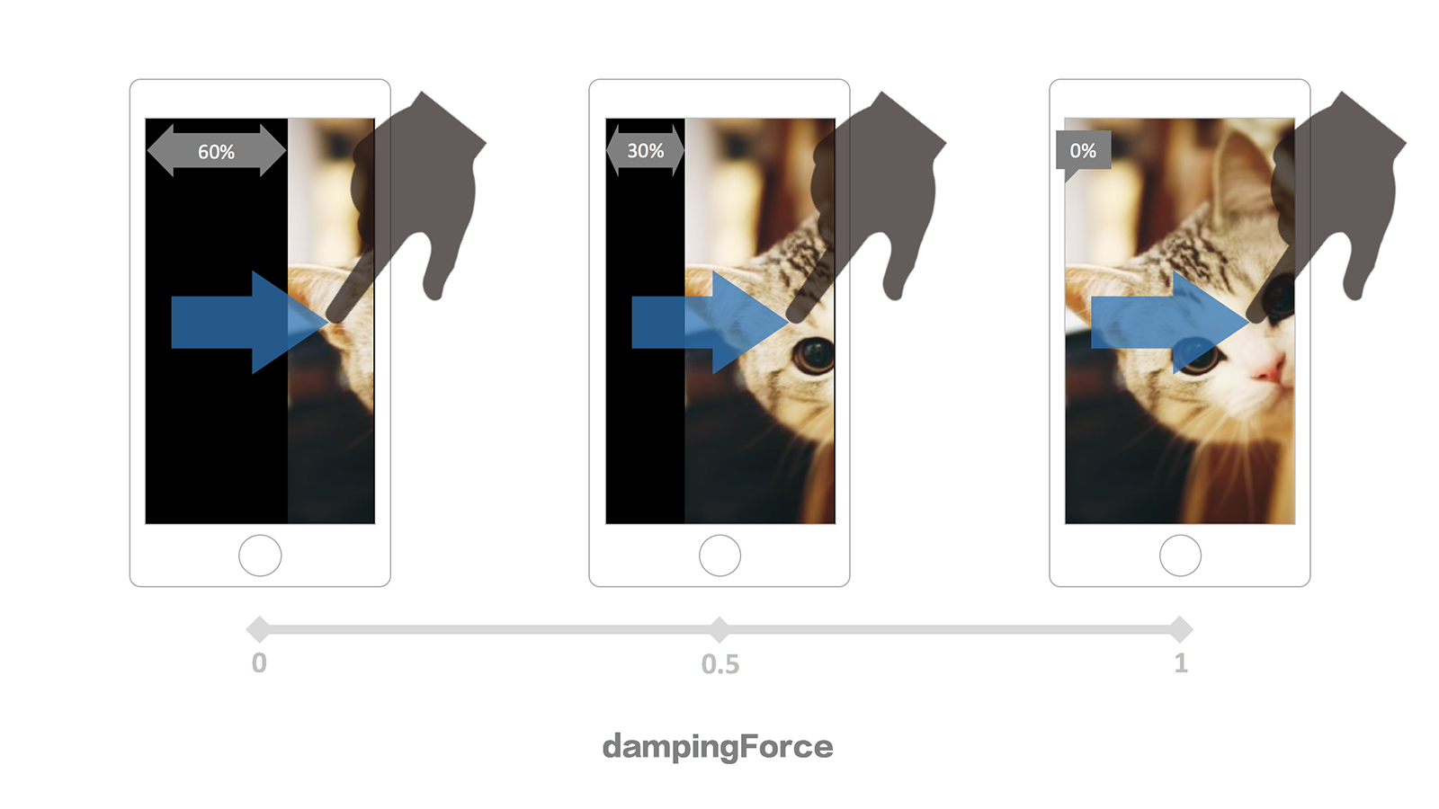
dampingForce
{Number}
Damping force, the rebound effect of overflow Scene
Range: 0 ~ 1, Sliding distance decreases with increasing values (more difficult to slide)
Default: 0
Precondition: isLooping === FALSE
isVertical
{Boolean}
Vertical sliding mode
Default: false (Disabled)
isOverspread
{Boolean}
Background Tile
If the scene is picture mode (URL), use the CSS3 backgrounds ways to filling the scenes
Default: false (Disabled)
isTouchable
{Boolean}
Touch events
Default: true (Enabled)
isDebug
{Boolean}
On / off debug mode, it will print more information about the log
Default: false (Disabled)
initIndex
{Number}
Index of the list which is used for the first screen
Default: 0
fingerRecognitionRange
{Number}
The scope of wrong touch, if it's bigger than the value of scope, the touchMove will be treat as an effective distance of slide
Default:10(px)
fixPage
{Boolean|Array|String}
Prevent native event
Prevent to trigger the event in the scene shield, such as: scroll, drag, zoom, etc.
"A" elements, prevented, the mobile terminal is recommended to use user-defined tap (touch-based event jointly judgment)
For the form element "SELECT", "INPUT", "TEXTAREA", "BUTTON", "LABEL", in any situations it will not to be prevented
*Exclude strategies:if the type of param is string(rule,querySelector selector string)or Array(mutiple regulations),this option is in opening status(true)and exlude elements with composite regulations, treat asiSlider.FIX_PAGE_TAGS
Default: true (Enabled)
fillSeam
{Boolean}
To fill the gaps between scenes
There is some rendering problems in the browser of some systems, resulting in a gap between scenes, this situation is particularly evident when the scene had setted the background color and use ** ** for connected.
Default: false (Disabled)
plugins
{Array}
Enable plug-ins and configure the initialization parameters
Incomming a name list of plugins which would be actived: ['dot', 'button', 'zoompic', ...], in addition, it's support incoming initialization parameters: [..., ['zoompic', {zoomFactor: 2}], ...]
It will be ignored if the plug-in does not exist or is not loaded
Event callbacks
{Function}
Incomming at initialization, it's needed to beginning with on and it would to be Camel-Case
OR all lowercase!! Will be discarded, If the Camel-Case or All-Lower-Case coexist, the Camel-Case will be used.
Binding with method "on" at living example, please use the Camel-Case, refer to the following list.
*Due to the different scenes,callback method should be different , there will be different between the incoming parameters.
Example:
varS=newiSlider({
...,onSlideChange: callbackonSlideChanged: callbackonslidechanged: callBack,// !!All lower case will be abandoned, and now, it will be covered camelCasing
...
});// ORS.on('slideChanged',callBack);
initialize
Start initialization (After the call setting, Before rendering)

 客服电话
客服电话
 APP下载
APP下载

 官方微信
官方微信


请发表评论